SBU
A website for a builder of business parks, drawn on vertical construction lines. Text and images had to meet those lines exactly, down to the pixel.
- {Client}
- SBU Park
- {My role}
- Front-end & WordPress development
- {Stack}
- WordPress, CSS, JS, PL / EN
- {Design}
- [Designer / agency]
- {Year}
- [YEAR]
- {Live}
- sbu.pl ↗
{Brief}
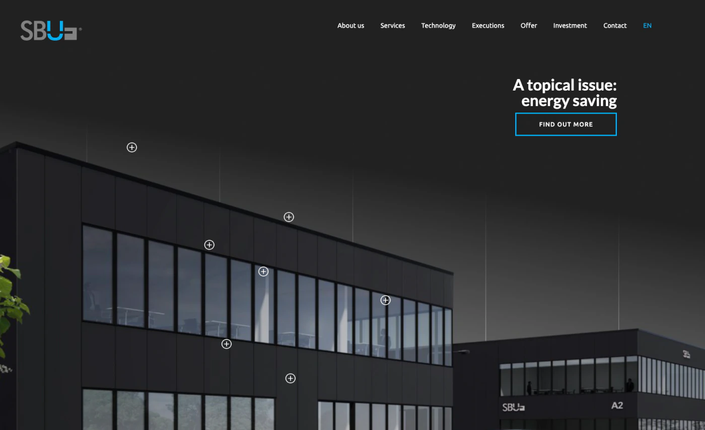
A design with its grid in plain sight
Most grids stay hidden, so a small slip goes unnoticed. Here the columns are drawn on the page as thin vertical lines, like on a construction drawing. If a paragraph or a photo missed its line by even a pixel or two, anyone could see it. [Adjust to the real brief.]
{What I did}
- Built the design in WordPress at pixel-perfect accuracy
- Aligned text, buttons and images to the visible line grid
- Carried the same grid through the dark and light pages
- Set up the Polish and English versions
{Highlight: Pixel perfect}
Text that meets the line, with 0 px to spare
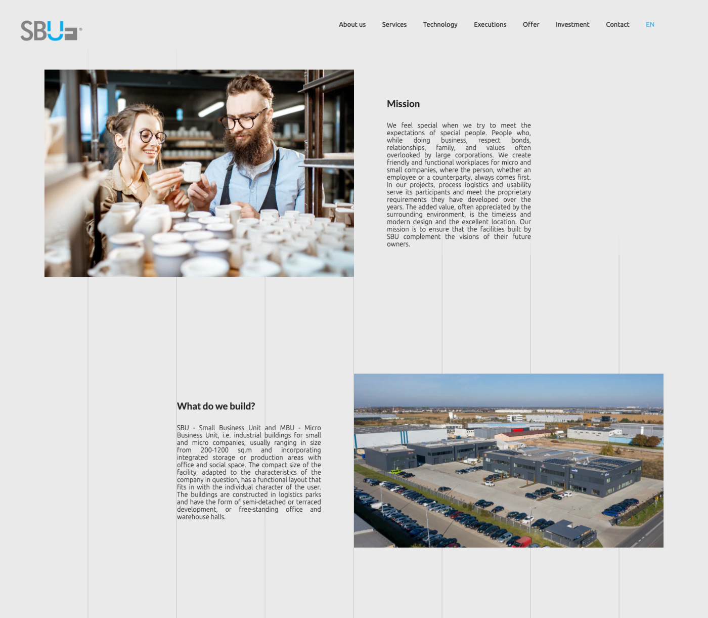
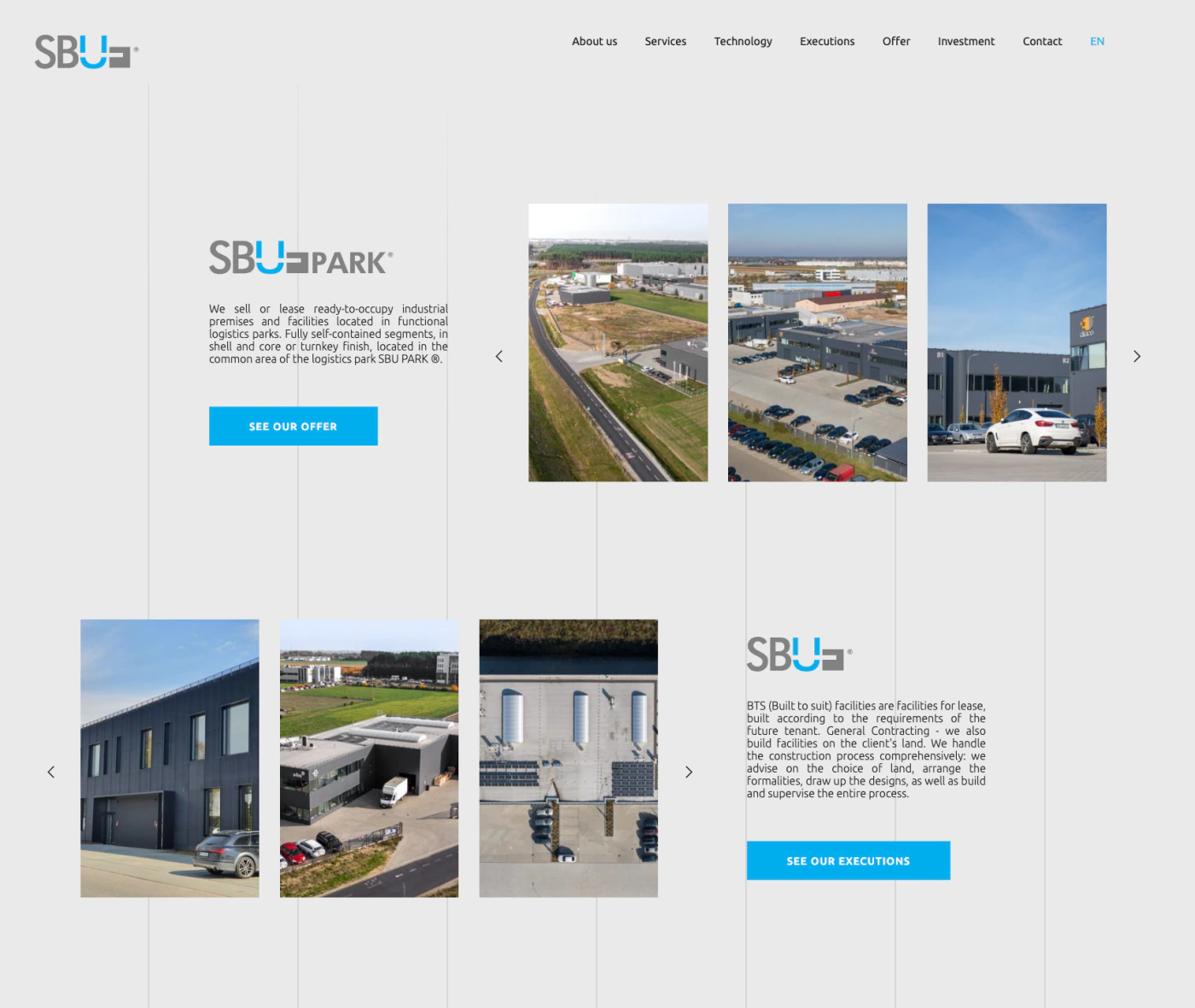
Seven lines divide the page into eight equal columns. Turn on the guides to see them highlighted over the real page. The zoomed views below show how the content sits against them.



{Measured on the 1720 px screenshot}
Spacing between lines, identical on the dark and light pages I measured.
The paragraph and button start on the first pixel after the line at x 428–429.
One photo ends on the centre line at x 858–859, and the other starts on the next pixel.
The justified paragraph ends exactly on the line at x 1288–1289.
{Key features}
Visible line grid
The vertical lines run behind the content from the header down to the footer.
Dark and light pages
Home, technology and executions are dark, and the other pages are light, all on one grid.
Executions
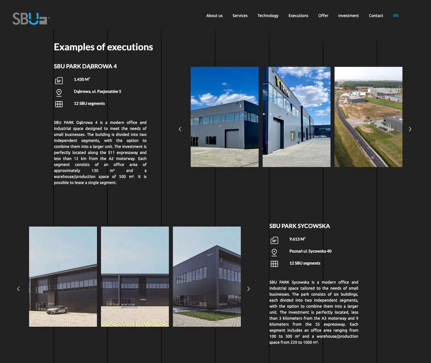
Finished parks with key facts, a description and an image slider, alternating left and right.
Technology story
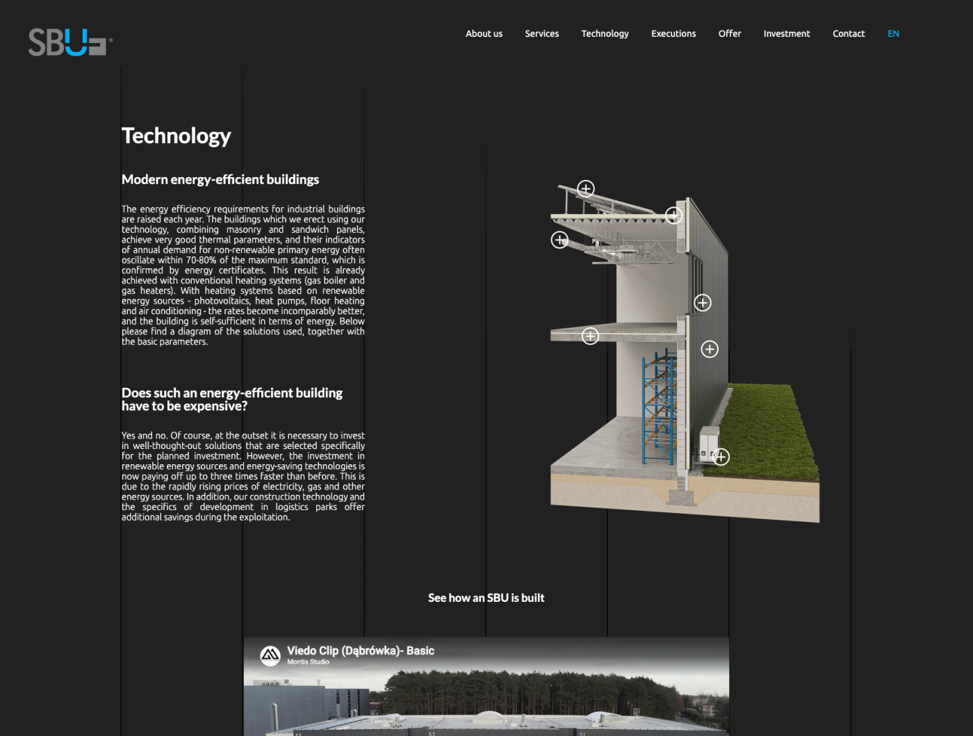
An explanation of the energy-efficient building, with a cross-section render and a film.
{Full page}
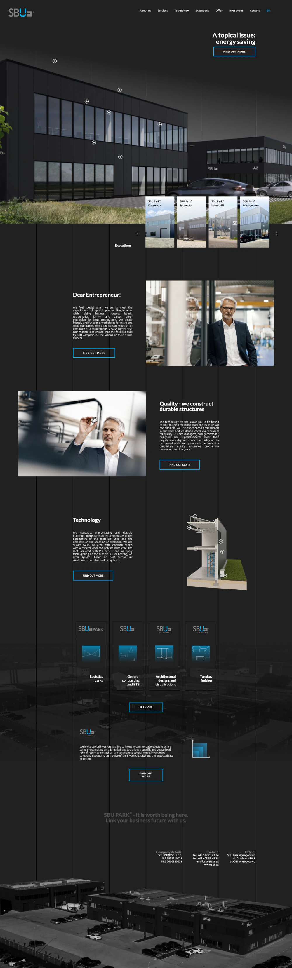
Scroll the home page
Follow one line from top to bottom and watch the content attach to it section after section.
- * WordPress
- * Pixel-perfect CSS
- * Dark + light pages
- * PL / EN
{Technical notes}
[How the lines and the content share one grid, how alignment survives other screen widths, what happens to the lines on a phone, and how you checked the result against the design.]
{Takeaways}
[The hardest part of the project and what you learned from it, in one or two sentences.]